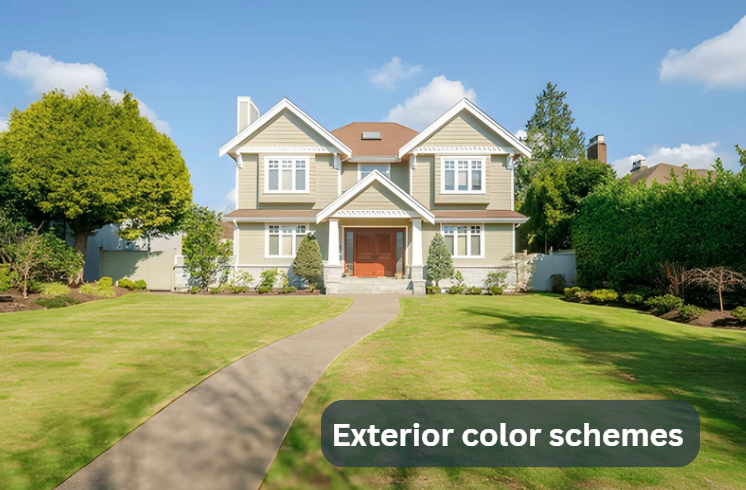
Exterior color schemes change how a home feels before anything else. Long before someone notices the windows, the roof, or even the design, they notice the color. That first impression is quick, but it sticks.
Some houses feel calm right away. Some feel modern and sharp. Some feel warm and inviting. Most of that comes from paint choices, not expensive design changes.
In the United States, homeowners are starting to treat exterior color more seriously. It is no longer something picked at the end of a renovation. It is part of the planning now. People think about sunlight, neighborhood style, and even how the house will look in different seasons.
This guide focuses on Exterior color schemes that actually make sense in real life. Not overly styled examples. Not unrealistic combinations. Just colors people are using on real homes in real neighborhoods.
Some are soft and safe. Some are a bit bold. But all of them are practical, and more importantly, they still feel good after a few years, not just on day one.
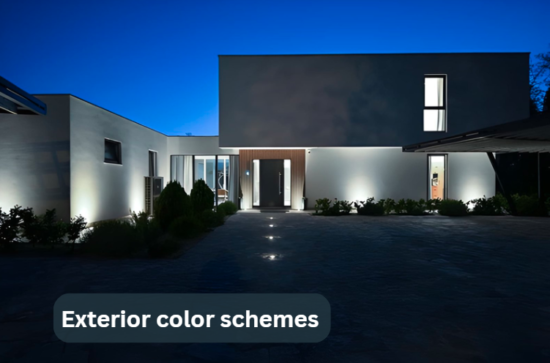
1. Warm White with Soft Black
White and black has always been popular, but the way people use it is changing.
Bright white used to be the standard. Now it is slowly being replaced with warmer whites. The reason is simple. Pure white outside can feel too sharp, especially in strong sunlight. It reflects a lot of light and sometimes looks harsher than expected.
Warm white feels more natural. It does not hit the eye too strongly. It blends better with outdoor light, especially in places with long sunny days like Texas, Arizona, or California.
When soft black or charcoal is added, the house gets structure. Windows, doors, and roof edges stand out in a clean way. The contrast is still there, but it does not feel aggressive.
This is one of those Exterior color schemes that works almost everywhere. It feels modern but not trendy in a way that will age quickly.
One thing people often learn too late is how different light changes paint. Morning light is soft. Afternoon light is sharp. Evening light is warm again. That is why testing colors on the actual wall matters more than looking at a small sample.
2. Earthy Green with Wood
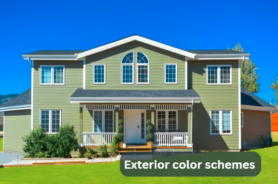
Green is quietly coming back, but not the bright or loud version.
The new version is muted. Sage, olive, and soft moss tones are showing up more on homes that want a natural feel. These colors do not fight the surroundings. They sit with them.
Homes near trees, parks, or open land fit this style well. The house feels like part of the environment instead of something placed on top of it.
Home renovation tips: Before finalizing a green shade, test it directly on your exterior wall instead of relying on a paint card. Look at it in morning light and again in the afternoon. Green tones can shift a lot depending on sunlight and nearby landscaping, so what looks soft indoors can feel darker outside.
Wood is what brings this combination together. It can be a wooden door, beams, shutters, or even small accents around windows. That warmth breaks the coolness of green.
This combination also connects with Contemporary architecture, where natural materials are used more often and shapes are kept simple.
Another practical thing is maintenance. Earthy greens do not show dust or small stains as quickly as lighter colors. That makes them easier to live with in dry or rural areas.
This is not a flashy style. It is quiet. But that is exactly why many homeowners like it. It does not feel like it will go out of style next year.
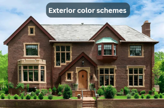
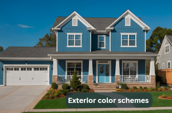
3. Deep Blue with White Trim
Deep blue has become one of the more reliable Exterior color schemes in recent years.
Navy and slate blue give a house a strong presence without making it feel heavy. It feels grounded. Stable. A bit more refined than lighter blues.
drhomey handy tips: When using deep blue outside, always check how it looks against your roof color and driveway material. A small mismatch can make the whole front look off even if the paint itself is good. It also helps to view the shade on a larger wall section instead of a small sample because darker blues tend to look lighter once applied over a wide surface.
White trim is what makes this combination work. Without it, the blue can feel too dark or flat. With it, everything becomes clearer. Lines stand out. Windows feel framed. The structure becomes easier to read.
This combination is used in coastal homes, but it is not limited to them. It works in regular neighborhoods too, even in inland cities. The feel is calm, not loud.
Lighting changes it in a natural way. In strong sunlight, blue looks rich and deep. In shade, it can lean slightly toward gray. That shift actually makes it more interesting instead of boring.
This is one of those combinations where balance matters more than anything. Too much blue without contrast can feel heavy. White trim keeps it light enough to live with long term.
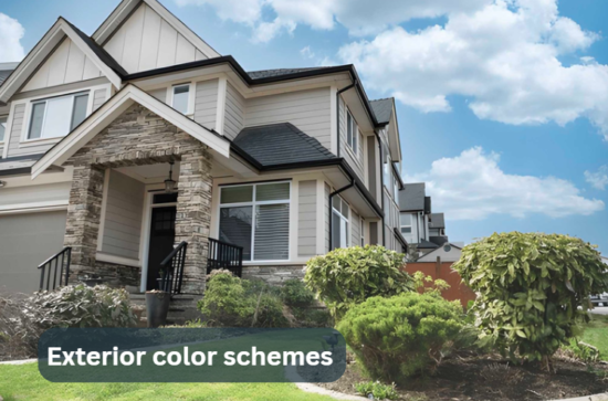
4. Soft Gray with Beige
Gray has been everywhere for a long time, but plain cool gray is slowly losing its appeal.
The problem is simple. It can feel flat or cold when used alone. That is why people now mix it with beige or warm taupe tones.
Beige softens gray. It adds warmth without making the house look yellow or old-fashioned. The result feels more balanced and natural.
This combination works well in suburban areas where houses sit close together. It does not demand attention, but it also does not disappear. It sits in the middle in a comfortable way.
It also works with many materials like brick, vinyl, or fiber cement siding. That makes it flexible for different types of homes.
This is one of those Exterior paint themes that quietly stays relevant. It does not depend on trends. It just works.
5. Charcoal with Natural Stone
Dark homes are becoming more common, especially in modern builds.
Charcoal is usually preferred over pure black because it feels a bit softer on the eye. It still gives that depth people want, but it doesn’t feel too heavy or harsh when you actually see it on a full house.
When you pair it with natural stone, the whole look starts to feel more balanced. The stone breaks up the flatness of the dark paint and adds texture. Without that, a dark exterior can sometimes look like one solid block, which feels a bit flat in real life.
useful tips drhandybility: If you’re choosing a dark exterior, think about upkeep before anything else. Dark colors will show dust and fading more clearly over time, especially in strong sun. A decent quality exterior paint makes a big difference, and an occasional wash helps keep the color looking even instead of patchy.
This combination is often seen in mountain homes or areas with natural landscapes. It feels strong and grounded, almost like it belongs to the land.
Roof color is important here. If the roof does not match the siding tone, the entire look can feel off even if everything else is right.
This is also one of those home design trends where quality paint matters more. Dark colors tend to show fading more if the paint is not good.
6. Beige and White with Soft Contrast
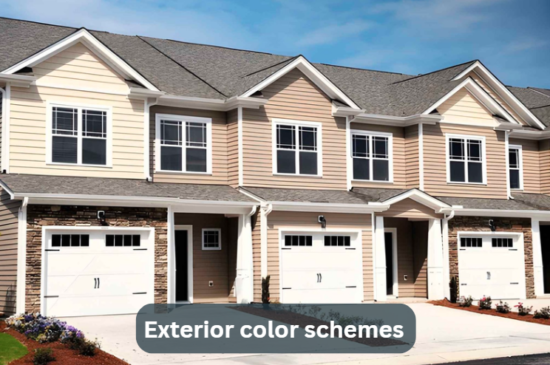
Beige and white is a simple combination, but it still works for a reason.
The modern version is softer than older styles. Instead of strong contrast, the tones are closer together. That creates a smoother look.
drhomey interesting facts: Homes with softer beige and white exteriors often feel “warmer” to the eye even when the colors are technically neutral. Small shifts in undertone can change how large or welcoming a house appears, especially in natural daylight.
This style works well in hot climates because it reflects heat. It also feels friendly and familiar, which is why it is still common in many residential areas.
Small details make a difference here. Window frames, trim depth, and even texture can keep the design from feeling too plain.
This combination often shows up in Curb appeal ideas because it appeals to a wide range of people. It is not bold, but it is safe and consistent.
7. Black with Wood Accents
Black houses are no longer rare. They are part of modern residential design now.
But full black can feel too strong on its own. That is where wood comes in. Wood breaks the darkness and adds warmth back into the design.
It can be used on doors, ceilings, or exterior panels. Even small touches make a noticeable difference.
This style works best with simple architecture. Clean lines, large windows, fewer decorative details.
It is one of the more modern outdoor color palettes and fits well with modern architecture. It focuses on shape and contrast instead of decoration.
Maintenance is something to think about. Dark colors can fade faster if low-quality paint is used, especially in strong sun.
8. Light Blue with Gray Undertones
Light blue with gray mixed in is a soft and flexible choice.It doesn’t feel overly bright or boring. It sits in a calm middle space that works in many environments.
The interesting part is how it changes with weather. On cloudy days it feels more muted. On sunny days it feels slightly brighter and fresher.
This natural shift keeps it from feeling boring over time.
It also works well with white or light gray trim, which keeps the look clean and simple.
This is one of those subtle paint combinations people choose when they want something safe but still slightly different from standard neutrals.
Conclusion
Exterior color schemes shape how a home feels every single day.No single option is ideal for every home. Some homes need contrast. Some need softness. Some need something in between.
The color’s appearance in real light, not simply in a sample, is crucial. Light changes everything, and so does material and surroundings.
The best choices are usually simple ones that still feel right after you look at them more than once. Not just exciting at first glance, but steady over time.